Posted on

How to sew boxed corners

Corners are tricky. Whether you are painting them, moving furniture around them, trying to see around them, or sewing them- corners always need some extra attention.

There are several ways to sew corners. In this blog I’ll show you the method that I like to use when sewing my bags. I use this method because I reliably get the same size corner on both sides of the bag.

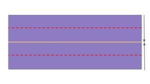
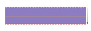
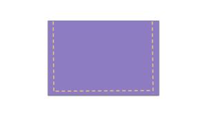
To begin, sew two pieces of fabric, right sides together, with a quarter inch seam allowance. Sew down one side until you are a quarter inch from the bottom, turn your fabric 90 degrees, and continue to sew along the next side. (You can use whatever seam allowance you want, just make sure you keep it the same on both sides of your corner.)

CornersStep1
Sew along the edges of your fabric.

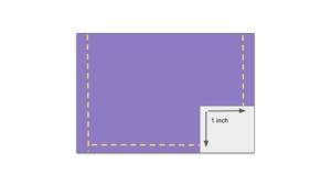
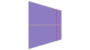
The next step is to determine how deep you need your corners to be. If you want a two inch deep corner, you’ll need a one inch square: Use half of the desired depth to draw a square on the corner of your fabric*.

CornersStep2
Measure half of the desired corner depth.

Cut out the square.

CornersStep3
Cut the corner, open the hole, and line up the side and bottom seams.

Now, pinch the corner of your cut out square to open it. Roll your fabric, so that the seam from the side of the bag lines up with the seam on the bottom. Your fabric should be in a straight line, with the seam in the middle of the fabric edge, perpendicular to that edge. I push my seam allowance to one side. Pin in place.

CornersStep4
Sew along the edge (red line) to close the corner.

Sew along the straight edge to close your corner. I use the same quarter inch seam allowance. Flip your fabric right side out. And there you have it! A three dimensional piece of fabric, with aligned seams!

*The fine print: Cutting a corner at an EXACT depth requires some more careful measurements. In the example above, the hole that was cut for the corner was two inches deep, but then I sewed it another quarter inch away from the edge. Technically, the resulting corner is about 2.25 inches deep. To get EXACTLY two inches deep, cut your corner hole slightly less than one inch, roll your fabric and pin as above. Place a ruler parallel to the edge of the hole and move it away from the hole until the fabric measures two inches from top to bottom. Draw a line on that spot and sew on top of this line. Now your finished corner should be two inches deep.


Posted on

How to sew tote bag handles

Today I will show you how to make a tote bag handle that is one inch wide and 22 inches long.

Cut a strip of fabric 4 inches by 22 inches.

Fold the fabric in half the long way, wrong sides together. Iron along the fold to make a straight line at the center of the fabric. Open the fold.

HandlesStep1
Fold the fabric in half along the long edge.

Fold one long edge of the fabric down to the center line, wrong sides together. Iron the crease. Fold the second long edge up to the center line and iron.

HandlesStep2
Fold the top and bottom edges to the center line.

Fold the top down again along the center line. You should now have a one inch wide strip of fabric.

HandlesStep3
Fold in half one more time to close the handle.

Pin the handle together, including the short edges. Sew along the edge, starting at the short end, along the long, open side, and up the other short end. I found that the key to keeping my fabric together while sewing was to pin the short edges in place. Otherwise, my fabric starts to unfold as I’m sewing the long edge, and it’s a mess by the time I get to the other end.

HandlesStep4
Pin and sew around the open edges to finish the handle.

There you have it! A clean, sturdy handle for a tote bag!

Posted on

Summer Solstice

I wanted to share this fun, summer-inspired fabric in honor of the summer solstice:

Sunglasses

Fabric Name- This and That by Ann Kelle for Robert Kaufman

Material- 100% cotton fabric

Background color- hot pink

Description:

Retro black, white and gray sunglasses on a bright pink background.

This fabric is so much fun! I love the color combination, plus the design of the glasses. It reminds me of the 1950’s. My favorite pair has a black frame with white polka dots, and pink lenses.

Enjoy your summer!


Posted on

Why is my printed image so dark? An example of RGB and CMYK color display using zinnia fabric

With a store named Zinnia’s Closet, I just had to buy this amazing zinnia fabric!

Zinnia

It is designed by Deborah G. Stanley for Elizabeth’s Studio, and the official name is Zinnia 571-Multi. I absolutely love this fabric. I am so happy that someone designed a pattern using zinnias!

I could talk about my love of zinnias all day. But today, I wanted to share with you an important lesson I learned when buying fabric. Fabric designed from a photograph does not always print as pretty as the picture it came from. Take a look at this photo below:

Zinnia Collage

The image on the top is a digital image taken from the manufacturer. Now look at the image on the bottom. This is a scanned picture directly from the fabric that I bought.

As you can see, the fabric image is much darker. The orange flowers in the top picture are almost red on the actual fabric. The image is not as crisp on the fabric. It’s still a very high quality image, but might be disappointing to an unknowing customer who only saw the top image, thinking their fabric would look the same.

So why do the two look so different? I tried to think of times in my life when a picture didn’t come out right on paper. Have you ever made a presentation for your boss and then tried to print it with a color printer? What looks perfectly fine on your computer screen sometimes looks dull and dark on paper. When I first printed my business cards, my fuchsia logo looked more like orchid. What happened?

Here’s a quick science lesson for you:

There are two kinds of color modes, RGB (red, green, blue) and CMYK (cyan, magenta, yellow and key/black). RGB comes from emitted light and is an additive color mode. You get every color in the spectrum by adding different amounts of red, green and blue light. The more light you add, the closer you get to white. CMYK comes from reflected light and is a subtractive color mode. The more color you add, the closer you get to black.

RGB_CMYK

What’s the difference between a computer screen and a piece of paper (or fabric)? Computers display colors by emitting light, while paper needs color placed on top of it, reflecting light. A computer light source combines different amounts of red, green and blue light to display the colors we see on the monitor. To get an image on a piece of paper, we use a four color process, combining cyan, magenta, yellow and black ink in varying amounts to get the colors we want. The two are completely different!

An image designed in RGB format can appear much darker when printed because CMYK does not have the dynamic range that RGB has. You might have heard of a color being out of gamut. That means a color cannot be achieved in that color mode. Colors like bright blue, fuchsia and lime green end up being printed much darker than displayed on a monitor, because they cannot be achieved as accurately in CMYK format.

There are many books on color theory and color management. It is much more complicated than I have explained here. So what does an untrained person do to get their colors right? Some software has the option to display an image in CMYK, like Photoshop, allowing you to see what your image would look like on paper before you actually print it. Other software does not convert images to CMYK, such as Microsoft Office products. In this case, a way to change your image would be to select a color that is lighter than what you intended, and do a test print on a color printer if you have one. That’s what I did after I made my business card mistake. Of course, there are other, more complicated and technical ways to change your colors, but I won’t get into that here.

Back to the zinnia fabric. I don’t know the specifics about the designing and printing of this fabric. Some of the colors in the photograph could have easily been out of gamut for the printer, but that’s just a guess. I still think the fabric is beautiful.

Good luck with your printed images!


Posted on

A Unicorn-Themed Birthday Party

This week I was honored to sew party favor bags for a sweet little girl’s first birthday! Her mom and dad were throwing a unicorn-themed party. I had the perfect fabric for them: Happy Little Unicorns by Robert Kaufman.

Happy Little Unicorns

It’s a pink fabric with three different unicorns. One is standing up with a bird on it’s back, the second is laying down, and the third is jumping over a rainbow. There are flowers, rainbows and stars filling in the background.

Happy Little Unicorns

The unicorns were spread out on this pattern. I had to carefully cut the unicorns out so that each bag had a unicorn centered on the front. It took some extra time, but it was well worth the effort. The parents were thrilled with the bags. They are putting a small framed picture of their daughter inside to thank their guests for coming to celebrate their special day.

I wish that little girl a lifetime filled with happiness.

Posted on

Awesome Science Fabric- Geek Chic by Studio e

IMG_20180126_0015

Fabric Name: Geek Chic Large Allover Fabric by Studio e

Material: 100% cotton fabric

Background color: Navy Blue

Other colors: Yellow, orange, sky blue, medium blue, lime green, red, gray.

Theme: Science

Description:

Laboratory glassware, chemical formulas and science icons outlined in white, on a navy blue background.

The chemical formulas and elements include: Cu, H₂O, H₂CO, H₂SO₄, N₂, NH₂, CO₂. Some chemical structures and reactions are: Cu + ½ O₂ →CuO, water, ethylene, CH₃-CH-C₃H₇, and ethane. The word CHEMISTRY is written in white letters. The fabric also has atomic rings, a beaker with a green liquid, a water bottle with blue liquid, and a gray ring stand holding a round bottom flask with bubbling red liquid. A blue burner is heating that flask with 3 yellow flames. There is an Erlenmeyer flask with a bubbling blue liquid, and a graduated cylinder with a yellow and orange liquid. Four bubbling test tubes are scattered throughout the pattern with yellow, orange, green or blue liquid. A fifth tube has green liquid that is not bubbling. Finally, there are two more beakers, one large and one small, containing a green liquid. They are connected by a curly blue tube dripping liquid into the smaller beaker.

This fabric is so colorful and cheerful! It makes me happy 🙂 Science is fun!


Posted on

Celebrating The Unofficial Start of Summer

IMG_20180518_0003

Memorial Day weekend marks the unofficial start of summer. It’s time to put away those heavy coats and snow boots and bring out the flip flops and sunglasses!

To celebrate, I wanted to share this fun fabric with you. An owl summer cookout! It has a patriotic theme with its red, white and blue colors. The red charcoal grill is smoking. One owl is cooking, wearing an apron and holding a spatula. Another owl is wearing sunglasses and waving a pinwheel. A third owl is hanging out eating watermelon. The fabric is decorated with flip flops, stars, watermelon, hot dogs and popsicles. It’s a great summer party!

Happy Memorial Day everyone!

Posted on

A Simple Note Makes an Impact

IMG_20180519_0002

The trip to the mailbox is typically uneventful. Magazines, bills, advertisements for insurance or cable… nothing exciting. When there is a birthday in the house or the holidays are drawing near, we’ll get some cards from family and friends. This week I went to the mailbox not expecting anything other than junk, when to my surprise there was a card addressed to me. It’s not my birthday, so what could it be? It was a Thank You note!

A few weeks ago I went to an event hosted by the college I attended. I didn’t think anything of it. I spent the afternoon chatting with fellow alumni about life back then and had a nice lunch. The school was there to talk about the big changes happening on campus starting in the fall.

So I opened my mail and was surprised to see a handwritten thank you note from the school representative that attended our event! She thanked me for spending the afternoon with her. She invited me, and she paid for lunch, and there she was, thanking me! I was so surprised that she even gave me a second thought, not to mention take the time out of her busy schedule to sit down, hand write a note and put it in the mail!

With all the technology in our lives today, we are bombarded with emails, texts, and status updates. We never seem to take the time to write a letter with a pen and paper. I have to say, it is very refreshing. A small note goes a long way to let someone know that you care about them, that they are important to you. It really stands out and makes an impact.

Write a note to someone you care about today 🙂


Posted on

Happy Lab Week!

Timeless Treasures Chemistry White

April 22-28, 2018 is Medical Laboratory Professionals Week.

So in honor of Lab Week, I thought I’d share this science fabric by Timeless Treasures. It’s called Chemistry White, but it has physics and biology on it as well. I love how the design looks like the doodles you might find in a science notebook. The fabric is very detailed. There are wiring diagrams, chemical structures, math formulas and chemical reactions along with beakers, flasks, test tubes and other scientific equipment. Every time I look at it, I see something new!

Happy Lab Week to all the Medical Laboratory Professionals out there!