With a store named Zinnia’s Closet, I just had to buy this amazing zinnia fabric!
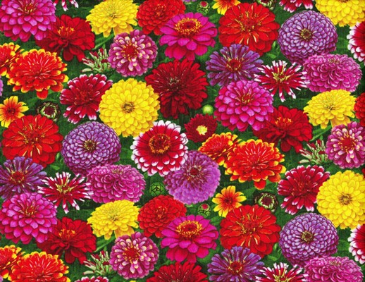
It is designed by Deborah G. Stanley for Elizabeth’s Studio, and the official name is Zinnia 571-Multi. I absolutely love this fabric. I am so happy that someone designed a pattern using zinnias!
I could talk about my love of zinnias all day. But today, I wanted to share with you an important lesson I learned when buying fabric. Fabric designed from a photograph does not always print as pretty as the picture it came from. Take a look at this photo below:
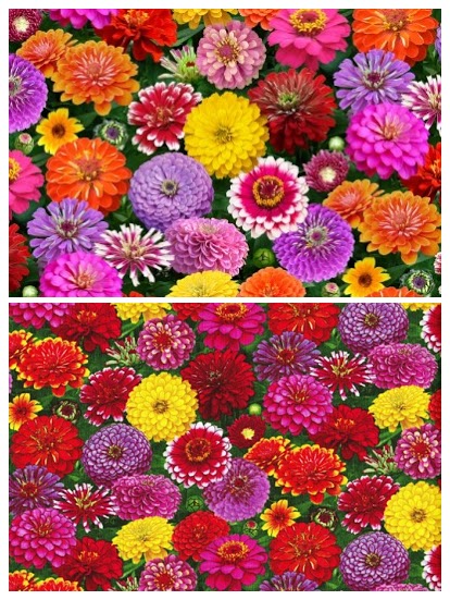
The image on the top is a digital image taken from the manufacturer. Now look at the image on the bottom. This is a scanned picture directly from the fabric that I bought.
As you can see, the fabric image is much darker. The orange flowers in the top picture are almost red on the actual fabric. The image is not as crisp on the fabric. It’s still a very high quality image, but might be disappointing to an unknowing customer who only saw the top image, thinking their fabric would look the same.
So why do the two look so different? I tried to think of times in my life when a picture didn’t come out right on paper. Have you ever made a presentation for your boss and then tried to print it with a color printer? What looks perfectly fine on your computer screen sometimes looks dull and dark on paper. When I first printed my business cards, my fuchsia logo looked more like orchid. What happened?
Here’s a quick science lesson for you:
There are two kinds of color modes, RGB (red, green, blue) and CMYK (cyan, magenta, yellow and key/black). RGB comes from emitted light and is an additive color mode. You get every color in the spectrum by adding different amounts of red, green and blue light. The more light you add, the closer you get to white. CMYK comes from reflected light and is a subtractive color mode. The more color you add, the closer you get to black.
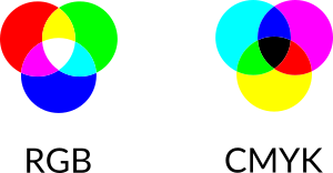
What’s the difference between a computer screen and a piece of paper (or fabric)? Computers display colors by emitting light, while paper needs color placed on top of it, reflecting light. A computer light source combines different amounts of red, green and blue light to display the colors we see on the monitor. To get an image on a piece of paper, we use a four color process, combining cyan, magenta, yellow and black ink in varying amounts to get the colors we want. The two are completely different!
An image designed in RGB format can appear much darker when printed because CMYK does not have the dynamic range that RGB has. You might have heard of a color being out of gamut. That means a color cannot be achieved in that color mode. Colors like bright blue, fuchsia and lime green end up being printed much darker than displayed on a monitor, because they cannot be achieved as accurately in CMYK format.
There are many books on color theory and color management. It is much more complicated than I have explained here. So what does an untrained person do to get their colors right? Some software has the option to display an image in CMYK, like Photoshop, allowing you to see what your image would look like on paper before you actually print it. Other software does not convert images to CMYK, such as Microsoft Office products. In this case, a way to change your image would be to select a color that is lighter than what you intended, and do a test print on a color printer if you have one. That’s what I did after I made my business card mistake. Of course, there are other, more complicated and technical ways to change your colors, but I won’t get into that here.
Back to the zinnia fabric. I don’t know the specifics about the designing and printing of this fabric. Some of the colors in the photograph could have easily been out of gamut for the printer, but that’s just a guess. I still think the fabric is beautiful.
Good luck with your printed images!